Outschool
We improved teacher application processes for an online school. It used to 70% of new teachers who tried to register had drop off.
-UI/UX design
About the project
Redesign
onboarding
process

The client
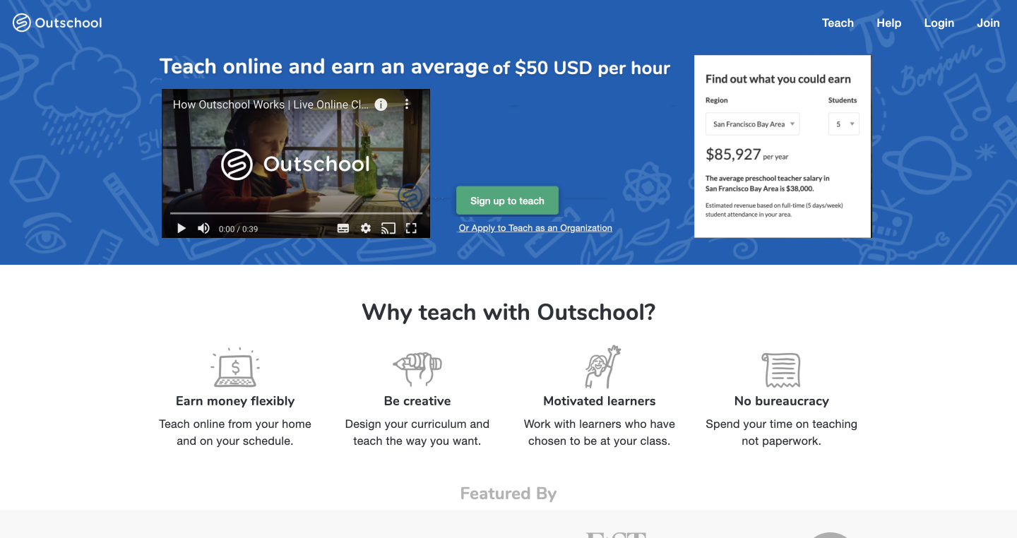
Outschool is a marketplace of live online classes for kids ages 3-18. Classes meet in small groups over live video chat where students are safely connected.
My Role
The project was conducted by five in-house designers and one designer from the client.(2019.6-7)
-User research, wire frames, prototyping, Usability testing
Pain Point
Users got tired and lacked motivation.
Outschool’s teacher application had a 70% drop-off rate. Many teachers are unfamiliar with IT software.
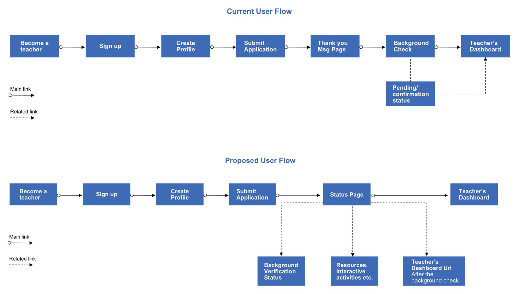
Problem1: There were many procedural transitions and the process was not clear and confusing.
Problem2: Lose motivation with long onboarding steps and unfamiliar online processes.
Get tired
Registration process is confusing. Information is scattered and not centralized. They also feel isolated and without support from Outschool.
Lack motivation
An application process is tedious. The psychological pain may exceed the benefits of becoming a teacher at Outschool.
Unfamiliarity with IT equipment
Many on-site teachers may be unfamiliar with IT equipment. It is important to incorporate a mobile approach whenever possible.
The gole
Reduce teacher's onboarding drop rate.
1,
Centralize the process in a dashboard to make the procedure look easy.
2,
Emphasize the benefits of working at Outschool to keep them motivated to finish their process.
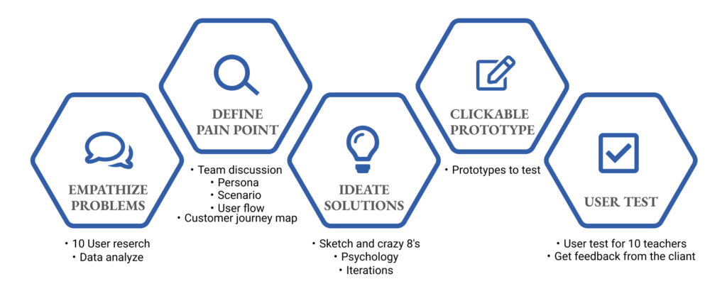
The Design process
5 step of design thinking
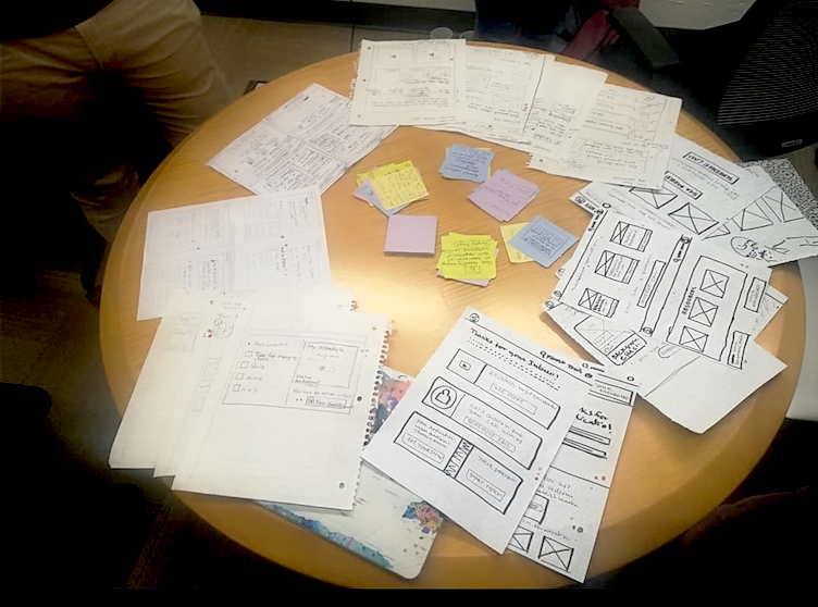
We first conducted user and competitive research to clarify the issues, and after discussions, we created a prototype and tested it with users.
The Final design
Our design has been implemented on their platform!
THE SOLUTION
HELPED REDUCE PROCESS DROP RATES AND INCREASE CONVERSION RATES.
PAIN POINT#1 : FELT TIRED
Make the procedure look easy by showing the whole process.
Online procedures are unfamiliar to many school teachers, and lengthy application processes and complex online procedures can tire teachers.

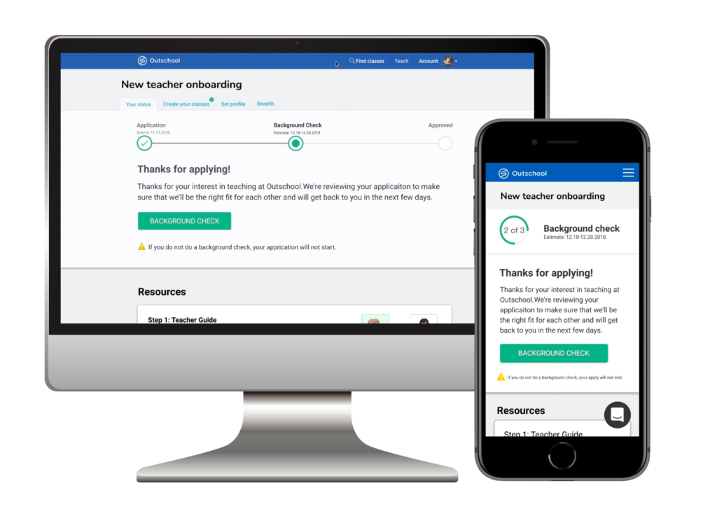
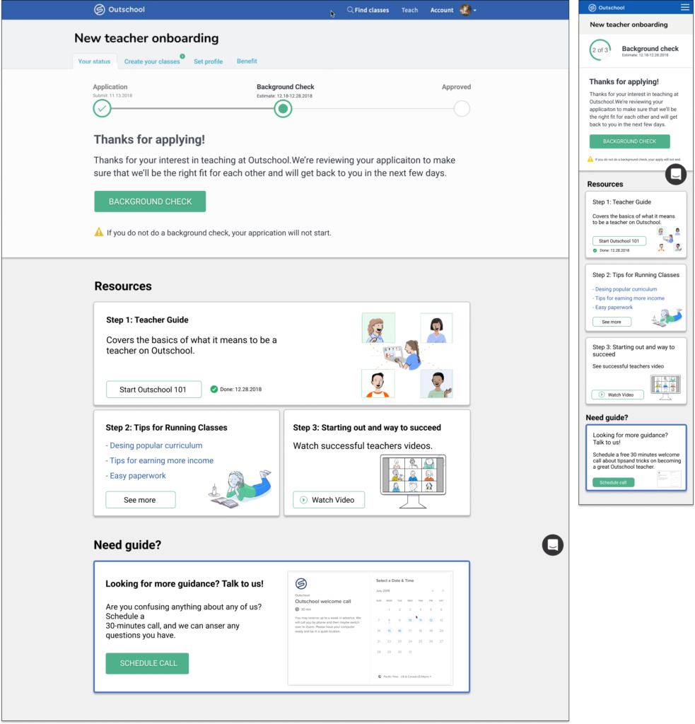
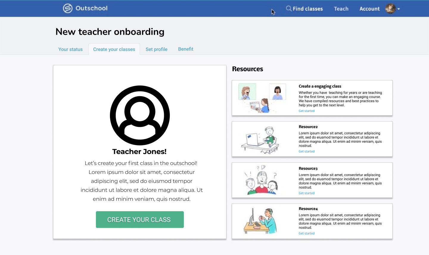
1, Create a main dashboard to manage the progress.
The current teacher registration process required going through various screens. The new main dashboard that guides teachers through the application process, making it clear what the user needs to do next.
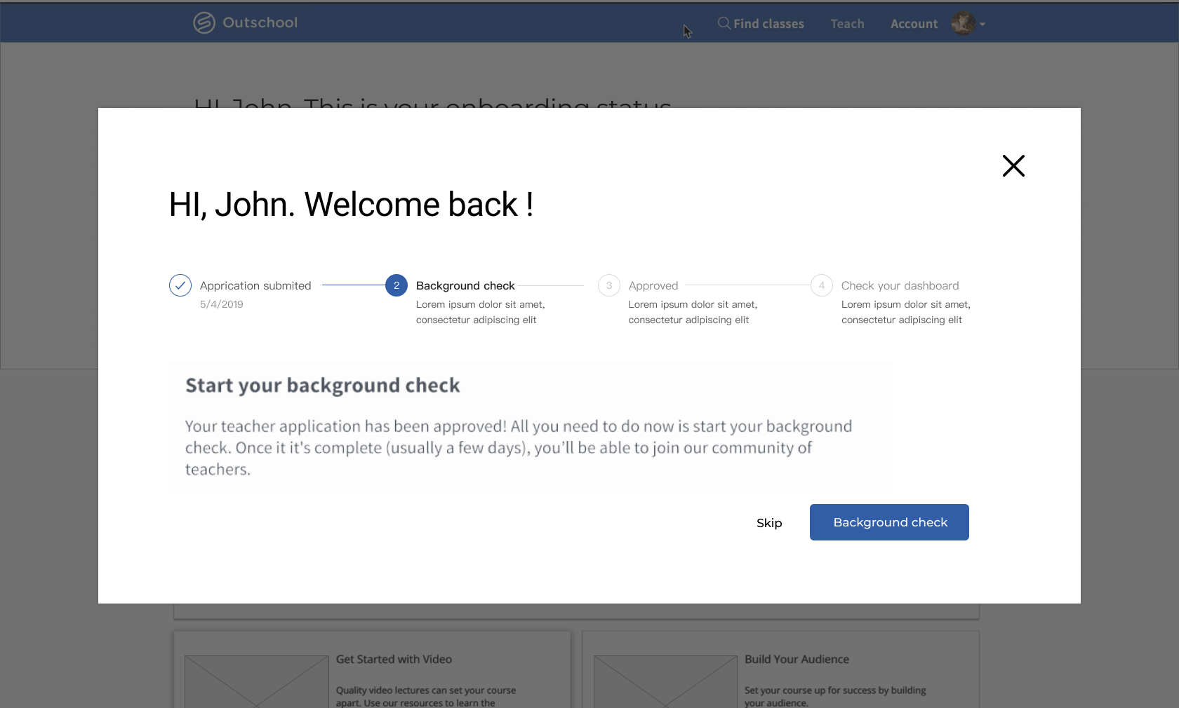
2, Every time they log in, a popup with their status.
Outschool is a marketplace of live online classes for kids ages 3-18. Classes meet in small groups over live video chat where students are safely connected.
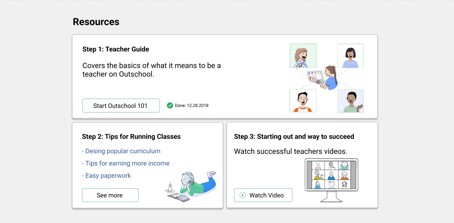
3, Easy access to useful resources
To help them better understand Outschool’s services, we have created a lead to existing video content on the dashboard. Display the most useful information cards for each step of the registration process
PAIN POINT#2 : LOSE MOTIVATIONS
Emphasize the benefits of working with Outschool to keep them motivated to finish the process.
Online procedures are unfamiliar to many school teachers, and lengthy application processes and complex online procedures can tire teachers.

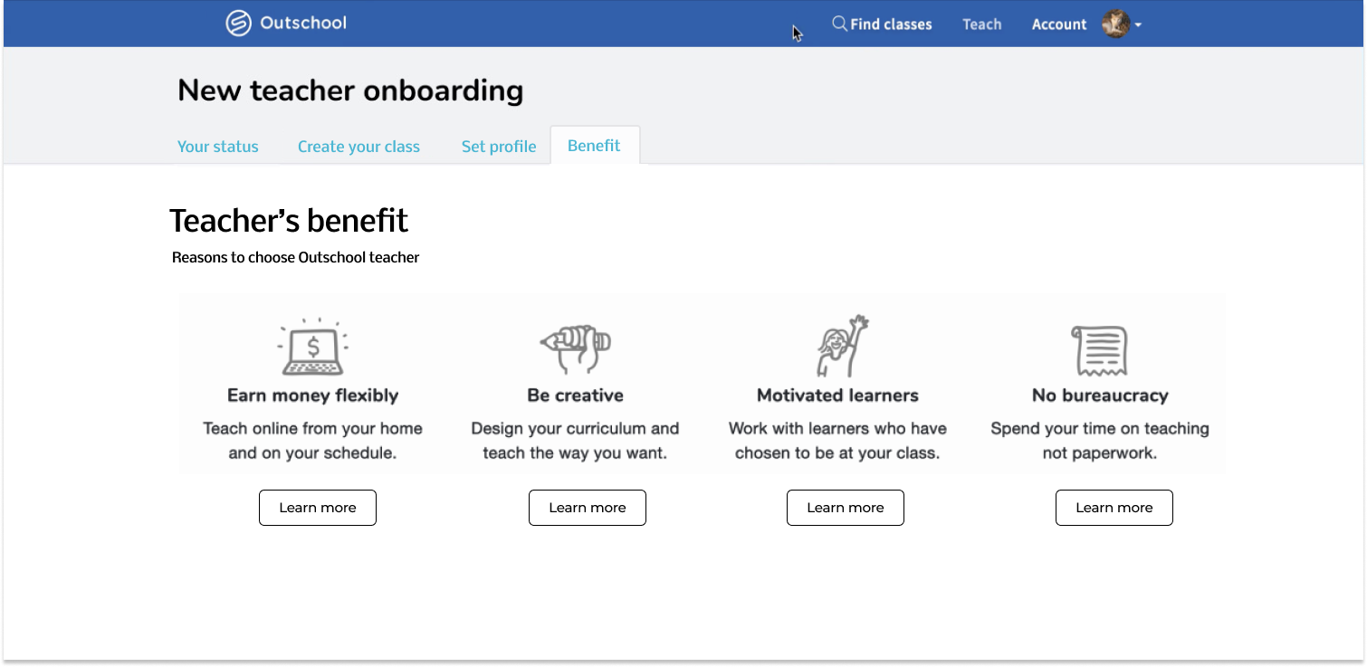
1, Emphasize the benefits working at Outschool
Currently, the only way to see the benefits was to go back to the website. They need also to see during the teacher registration process how easy it is to work at Outschool, how much money you can make, and other benefits compared to their current teaching job.
2, Every time they log in, a popup with their status.
Display a video and an estimate of the amount of money that can be earned at the top of the web page to make it easier to visualize how much money can be earned.
3, Create the first class
Have them do the work they most want to do when their motivation is highest.
THE ITERATIONS
HELPED REDUCE PROCESS DROP RATES AND INCREASE CONVERSION RATES.
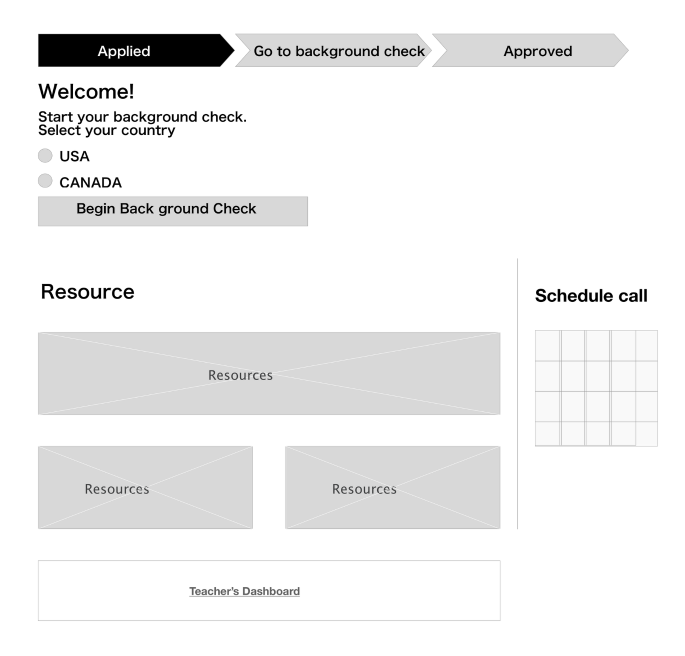
Version1
>Mobile first
Basically, it is expected to be done from a computer. However, the status of the registration process takes 2 days – 2 months and it is expected that the information will be viewed from cell phones. So we started to prioritize mobile responsive.
>Show Progress bar on the top
To make progress clear, we have created a status section at the top of the dashboard.
>Show resources on the page
Resources and schedule call are displayed.By using a card design for the content, we can also optimize the resources presented to the teacher depending on the stage of the registration process.
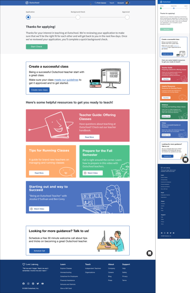
Version2
>Show progress bar and statement
Not only showing progress bar, Copy, CTA, and status changes based on the applicant’s stage.
>Show resources according their status
At the bottom, resources are displayed accordingly at that time.
Version3
>Tab
To make Outschool look more attractive, we showed “Create your class” “Set profile” “Benefit” on the tab. They can create their first class first day which their motivation is highest.
>Look and feel
White, blue, and green are the main colors, and they are not too loud.
VALIDATION TEST
The final design was verified through a second usability test conducted on 10 participants.
Feedback from users.
Good feedback
・I am glad that I was able to get to the information I wanted to know without getting lost during the process. ・I thought Outschool was an easy place to start.
Good feedback
The final design was verified through a second usability test conducted on 10 participants.
Bad feedback
・ I feel application volume is heavy. I may complete the process if I can get more benefit from outschool.
(Solution: Enhanced resources to make money more easily now as long as you complete the application. Testimonials from teachers who actually work at Outschool.)
Feedback from client product designer lead - Jing
Our team gave an on-site presentation and received feedback from the CEO, product designer, and engineers.
"I am impressed with the design, we will be working on implementation soon!"
The final design was verified through a second usability test conducted on 10 participants.